ACHEDFR French Citizens’ Association for Equitable and Sustainable Time
Non-profit association (French Law 1901), advocating since 1983 for the end of permanent double-summer-time (UTC+2).
Public health, sleep, energy, climate: we must return to a more natural time zone!
Infographic updated on 30 November 2025 – The opportunity to return to a more natural time zone ℹ️
To browse the infographic here. ℹ️ Scroll through the latest ACHEDFR infographic showing the time-choice options, impacts, and opportunities regarding health, energy, and climate. You may view below the complete PDF or the pages as images. This is an updated version of the infographic created for our Spring 2025 letters. It is also available in English.
If the infographics do not display correctly, you can also download the full PDF.
About this infographic:
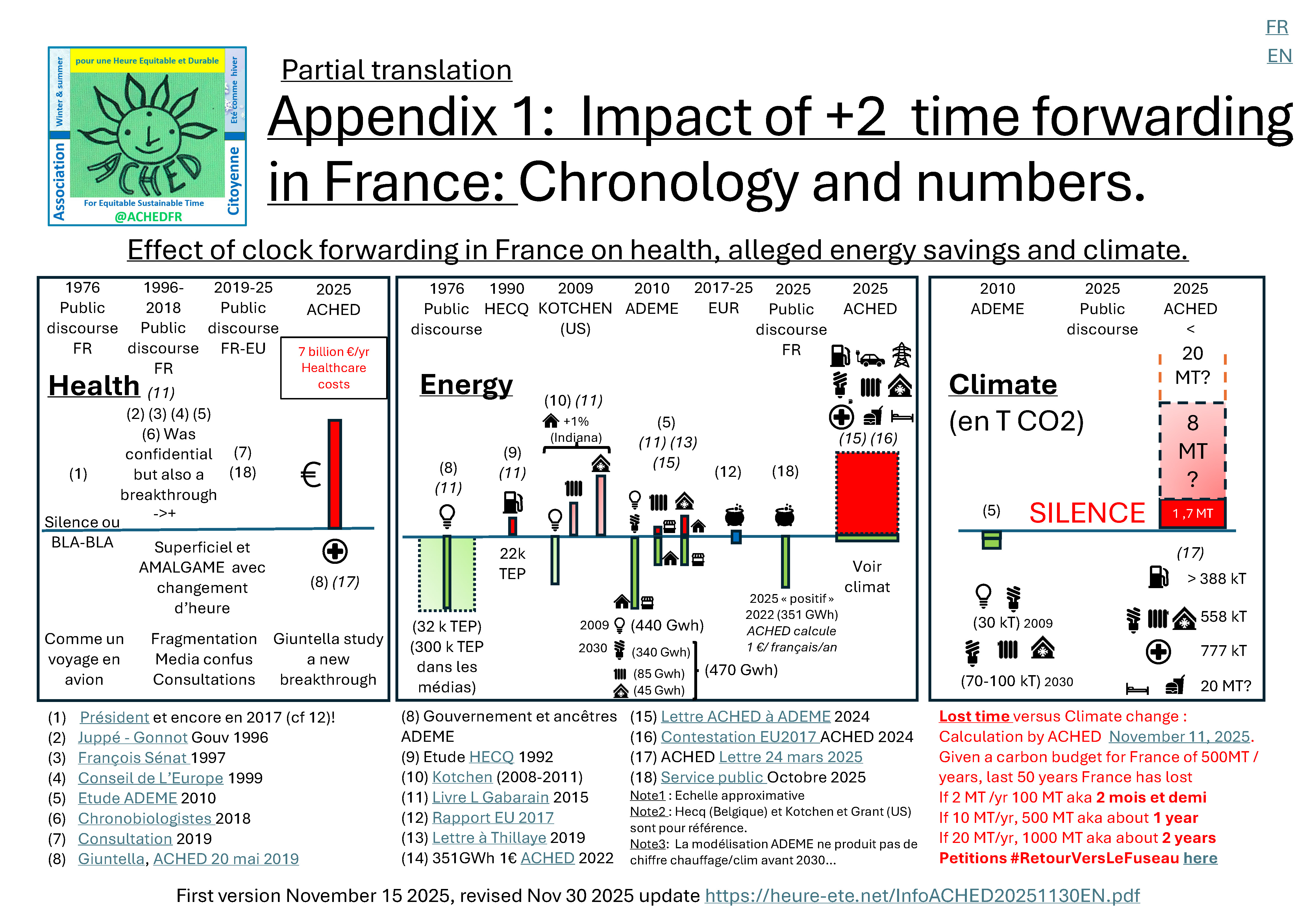
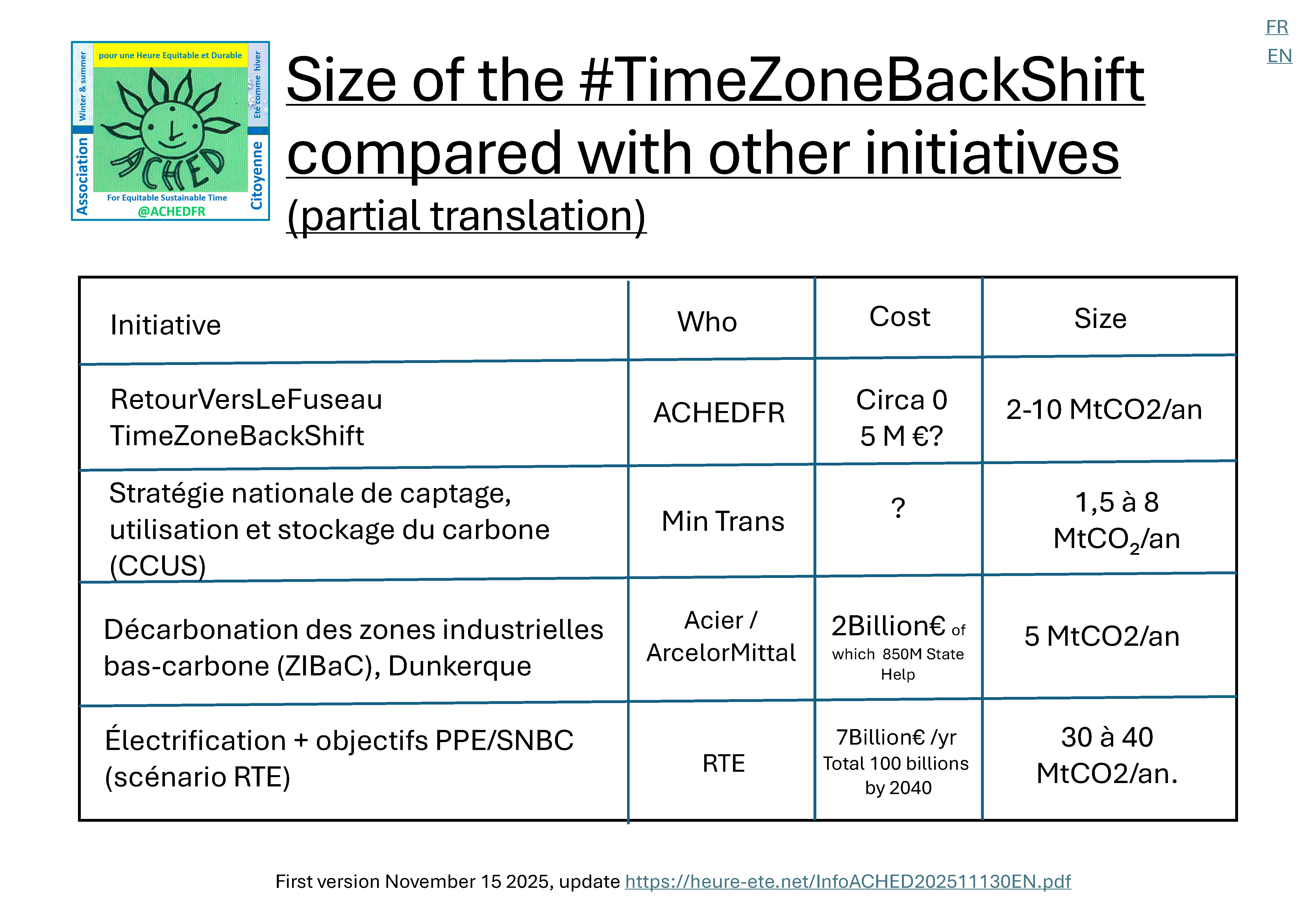
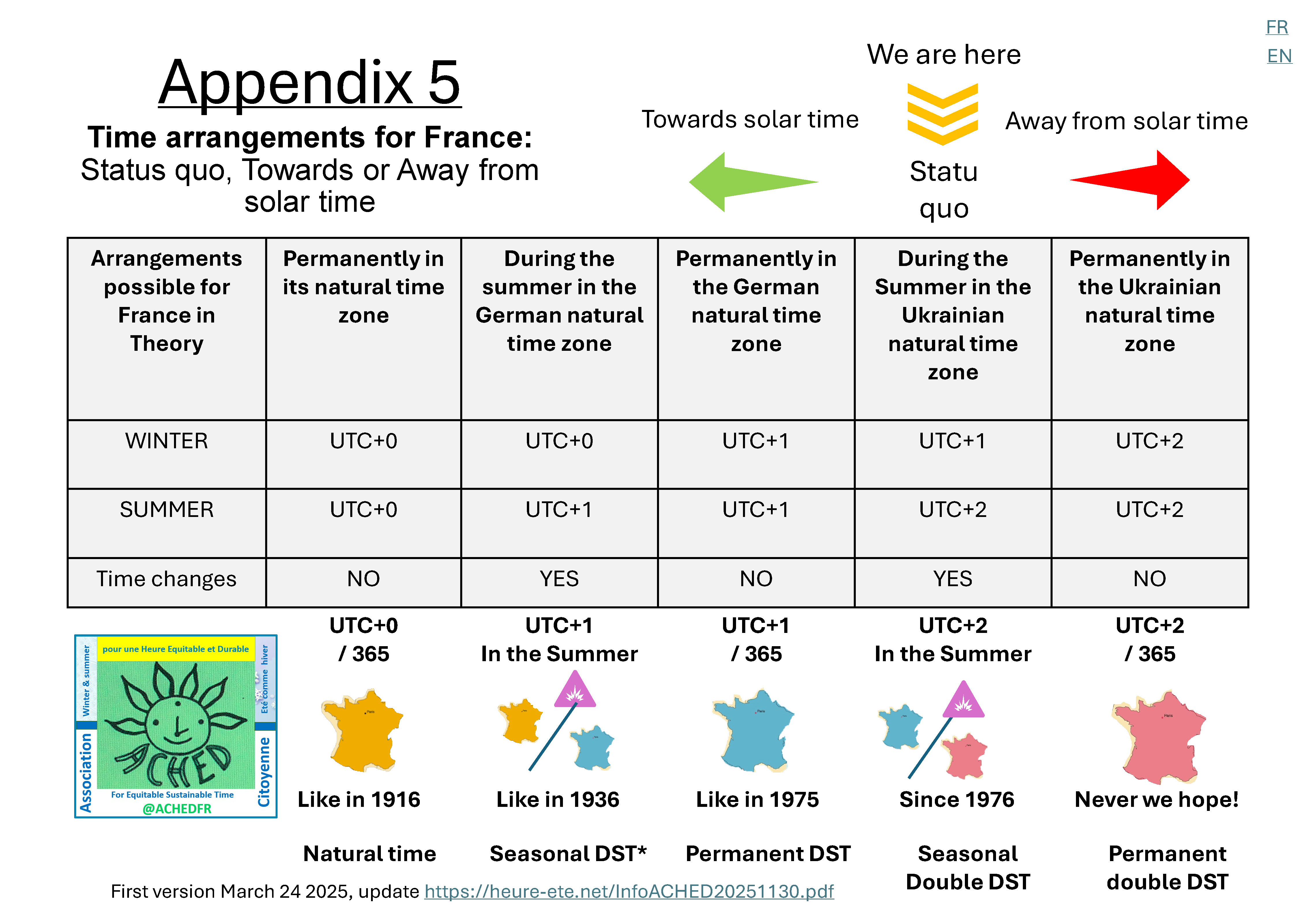
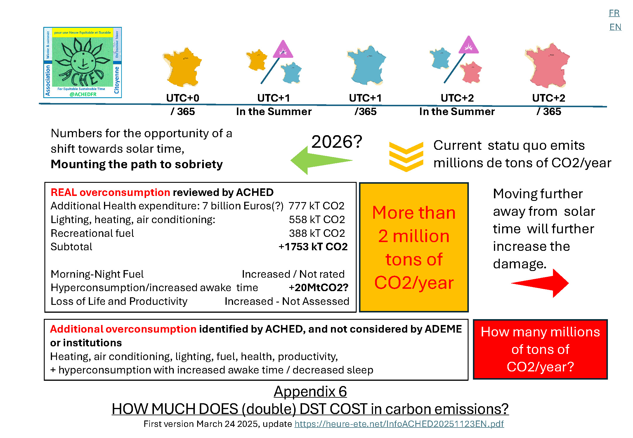
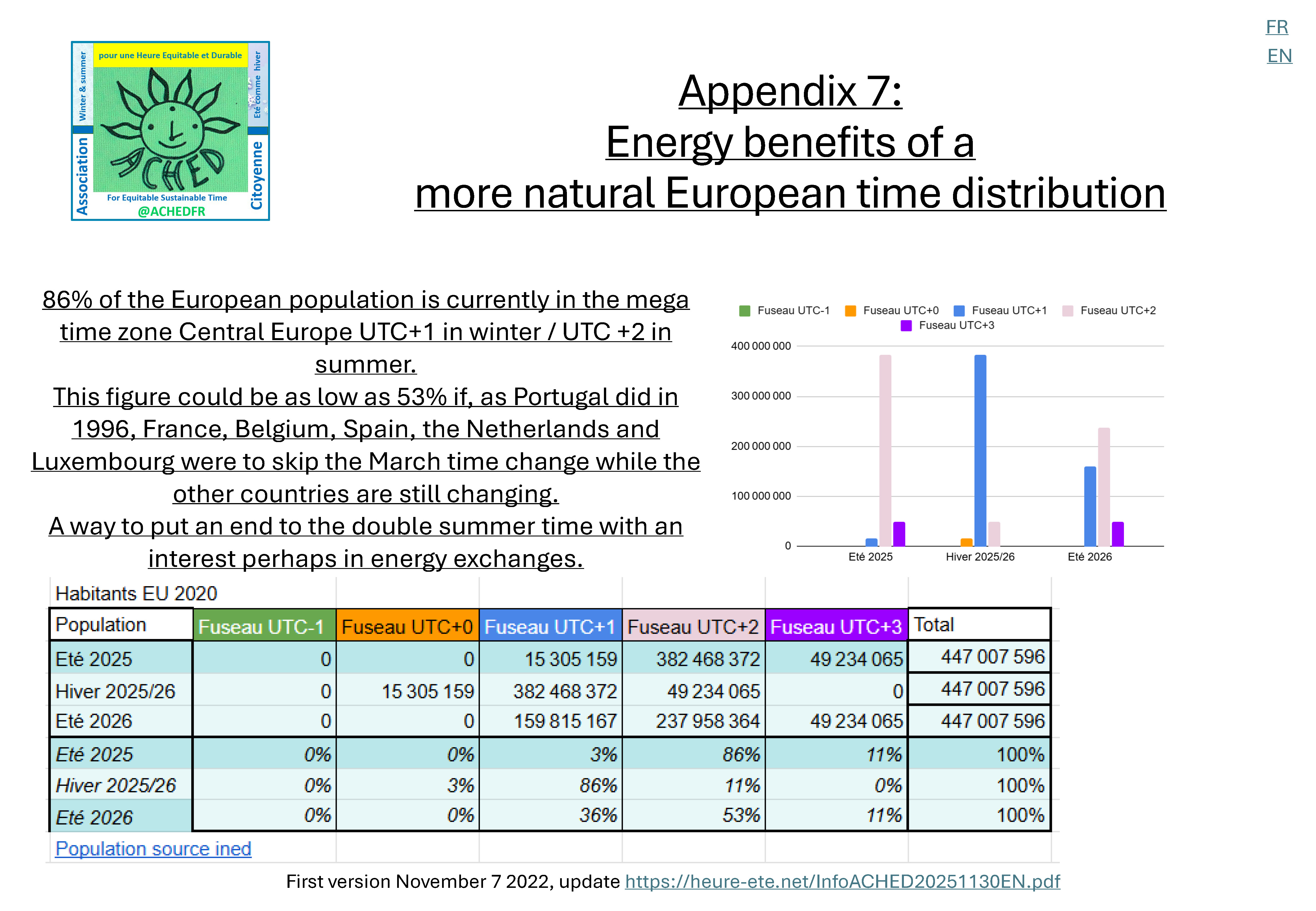
Topic: legal time. To help readers quickly understand the stakes, ACHED developed a new infographic to accompany its Spring 2025 letters. The aim was to visualise the situation, the options, and their magnitude.
We hope this infographic helps citizens and policymakers read more clearly and understand in order to act swiftly. We have continued enriching it since then.
You will find:
- a timeline
- figures
- references
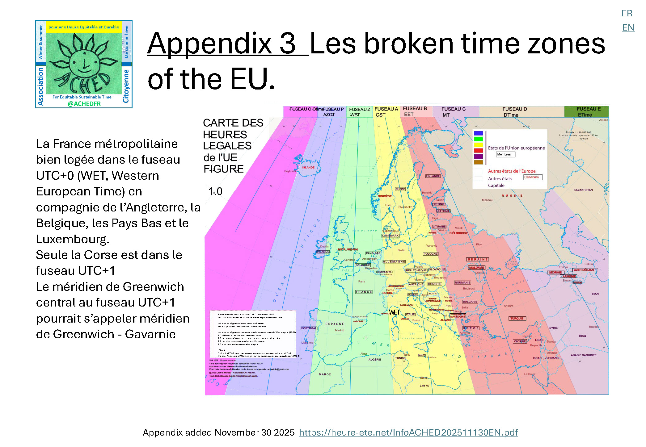
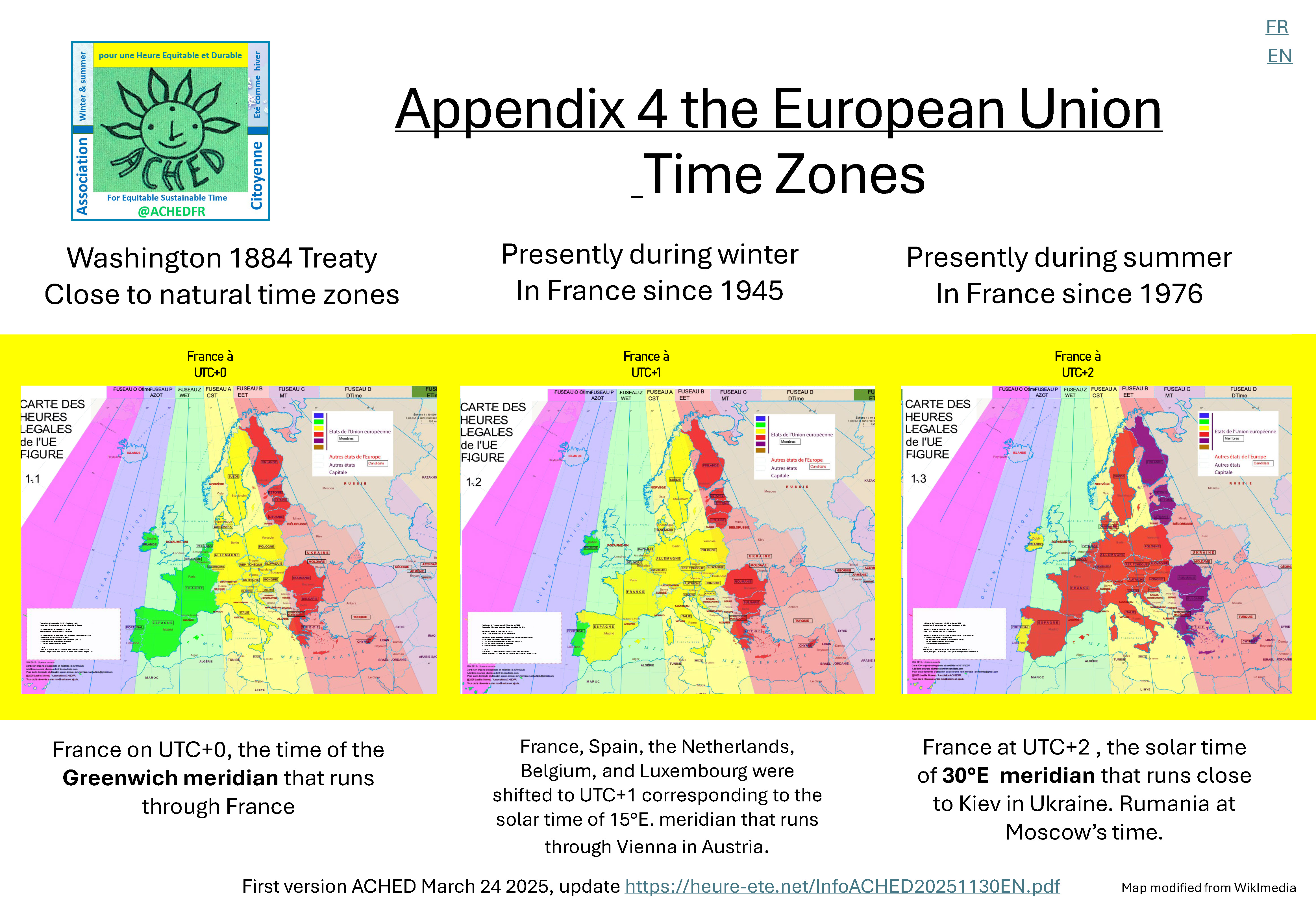
- maps
- diagrams
Most media, governments, associations and pro-summer-time lobbies present incomplete or misleading analyses. The notions of “summer time” and “winter time” are imprecise, the quoted figures are often old or partial, and the debate focuses on the clock change instead of on the permanent time advance (UTC+2).
ACHED seeks instead to present a complete evidence-based view, integrating health, climate, energy, and societal effects.